Technicolor
$0.00 - Free
This colorful and vibrant design is perfect for showing off your fashion products. With its clean and modern style you can be sure that your products are given the perfect platform to shine.
Back Select Design

Technicolor Info
A Note from the Author
Technicolor is heavily geared towards the rapidly growing mobile market and has been designed for mobile devices first and foremost, with enhancements when viewed on larger desktop screens making it perfect for everything in between too.
In-keeping with the mobile first theme, there is no graphical logo to give maximum performance and it uses the popular and well tested Zurb Foundation Framework for the greatest compatibility.
The responsive slideshow requires images of at least 970px width for the best effect, and this design also sports a handy Popular Products widget to really push those top sellers. It’s best suited to portrait product images (square will work nicely too) and they should be at least 220px wide by 330px tall. For the best effect with the Zoom plugin on the Product Details pages, you should try to double both of those dimensions - the bigger the better (don’t worry, we’ll optimize them automatically for you, to keep things fast) !
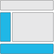
This design also has a compact Category dropdown in the main navigation as well as a Recently Viewed products widget for your customers convenience and a left banner area visible on Category pages.
Key Features
- Mobile Optimized
- Social Media Icons Supported
- Multiple Language Packs
- Popular Products Widget
- Soft Add To Cart
- Advanced Search
- Featured Products
- Offers & Promotions
Banner Areas
Browser Compatibility
- Google Chrome
- Firefox
- Microsoft Edge
- Safari
- Opera


