Redwood
$0.00 - Free
Attract the attention of your customers with this beautiful, responsive design. Boost sales and visitors statistics with the adaptable Redwood design.
Back Select Design

Redwood Info
A Note from the Author
Built using a responsive grid system, Redwood will quickly adapt to any device and any screen size. The flexible system allows your customer to see and get the most use from this design which will boost conversion as your customers will not be restricted with their chosen device.
Choosing this design will give you a medium sized logo area to work with – at 300px in width by 100px in height, you should have plenty of room to create and upload a great logo for your brand/ company.
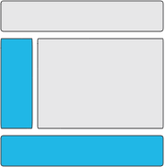
Redwood is great for stores which have lots of categories. Displayed on the left hand side, a plethora of categories can be viewed all at once for your customers to pick and browse.
A medium sized banner is available in the main content area of Redwood with a recommended size of 800px in width by 500px in height for the best visual aesthetics.
Key Features
- Mobile Optimized
- Social Media Icons Supported
- Multiple Language Packs
- Graphical Logo
- Soft Add To Cart
- Advanced Search
- Featured Products
- Offers & Promotions
Banner Areas
Browser Compatibility
- Google Chrome
- Firefox
- Microsoft Edge
- Safari
- Opera


